Card grid
One component — a three-card blog grid — converted to all four targets from the same Figma selection. This is real engine output, trimmed to the first card (cards 2–3 repeat the identical structure).
HTML & CSS
Semantic markup, BEM-style classes, responsive clamp() tokens. The grid reflows purely with flex-wrap — no media query needed for this component.
<div class="blogs">
  <h1 class="latest-news">Latest News</h1>
  <div class="box">
    <div class="blog-card">
      <img class="shape" src="assets/card.png" alt="Rectangle 4326" width="570" height="260">
      <div class="card-body">
        <p class="card-title">New Construction technology awarness.</p>
        <p class="card-text">Elinor her his secure far twenty eat object…</p>
      </div>
    </div>
    <!-- cards 2–3 … -->
  </div>
</div>

.box{display:flex;gap:30px;align-items:stretch;flex-wrap:wrap}
.blog-card{display:flex;flex-direction:column;gap:20px;flex:1 1 570px;min-width:300px;border-radius:10px}
.shape{width:100%;aspect-ratio:570/260;border-radius:10px;object-fit:cover}
.card-title{margin:0;font-size:clamp(14px,1.67vw,24px);font-weight:600;color:#1d1d1d}
.card-text{margin:0;font-size:clamp(14px,1.25vw,18px);color:#737373;line-height:1.35}
Gutenberg
Native core blocks — paste into the block editor's Code editor, no plugin required.
<!-- wp:group {"layout":{"type":"flex","orientation":"vertical"},
  "style":{"spacing":{"blockGap":"20px"},"border":{"radius":"10px"}}} -->
<div class="wp-block-group" style="gap:20px;border-radius:10px;display:flex;flex-direction:column">
  <!-- wp:image {"sizeSlug":"full"} -->
  <figure class="wp-block-image size-full"><img src="/wp-content/uploads/figma/card.png" alt="Rectangle 4326"/></figure>
  <!-- /wp:image -->
  <!-- wp:heading {"level":4} -->
  <h4 class="wp-block-heading">New Construction technology awarness.</h4>
  <!-- /wp:heading -->
  <!-- wp:paragraph -->
  <p>Elinor her his secure far twenty eat object…</p>
  <!-- /wp:paragraph -->
</div>
<!-- /wp:group -->
Oxygen Classic
Pastes as native Oxygen elements. Note the -unit convention (border-radius + border-radius-unit) that keeps values correct in the builder. The tree below is a readable summary — Copy puts the full, paste-ready .oxygen.json on your clipboard.
ct_div_block .card  { display:flex; flex-direction:column; gap:20px;
                      width:50%; border-radius:10px; }
  ├─ ct_image      "Rectangle 4326"  (width:100%, object-fit:cover)
  └─ ct_div_block  "Group"
       ├─ ct_headline  h4  "New Construction technology awarness."  (#1d1d1d, 24px/600)
       └─ ct_text_block    "Elinor her his secure far twenty eat object…"  (#737373, 18px)
Oxygen 6
Structure and styling are split: a typed element tree plus per-breakpoint class definitions — the card drops to full width at the tablet breakpoint automatically. As with Classic, the tree is a readable summary — Copy gives you the full .oxygen6.json.
tree:  Container(.card) › [ Image, Text(h4), Text(p) ]

class .card:
  breakpoint_base            → display:flex; flex-direction:column; gap:20px;
                                width:50%; border-radius:10px
  breakpoint_tablet_landscape→ width:100%
In the Oxygen builder
This isn't just code on a page — pasted into Oxygen, every part becomes a native, editable element. Here's this exact card grid selected in the builder, showing its real flex layout, gap and width controls:
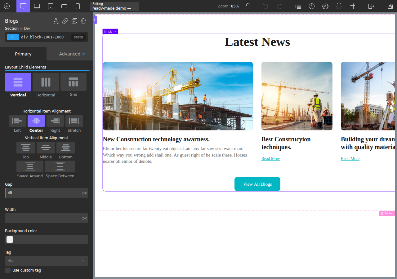
The breadcrumb (Section › Div › Div) and the layout panel are Oxygen's own — you keep building visually from here.
Design in, code out
The Figma design next to the converted section running live in Oxygen — same featured card, same two smaller cards, same image heights:

Same design in, four clean outputs — that's what "one engine, four targets" means. Read the Features → targets section for the interactive version.