Not a mockup
Same design in, real code out.
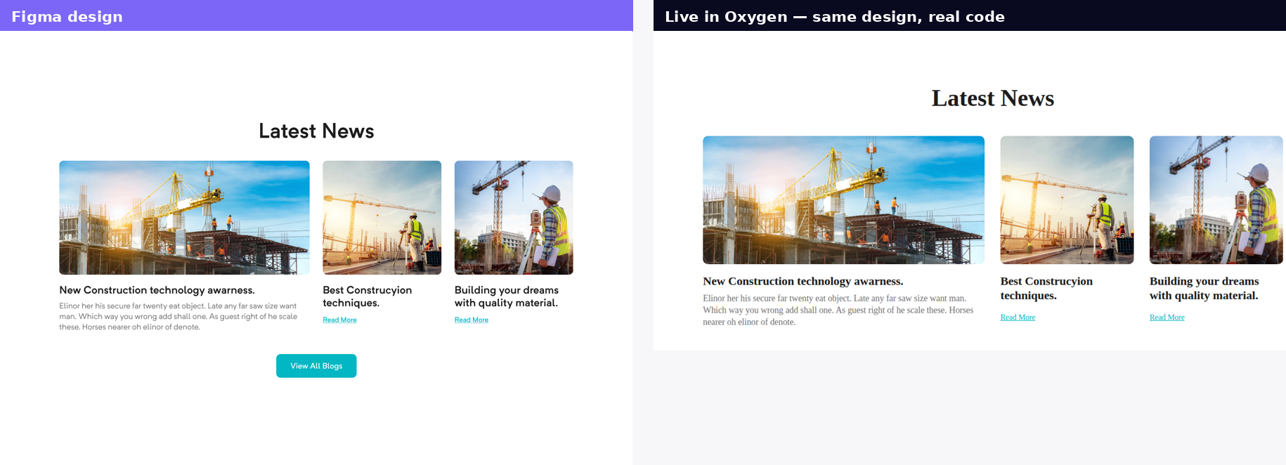
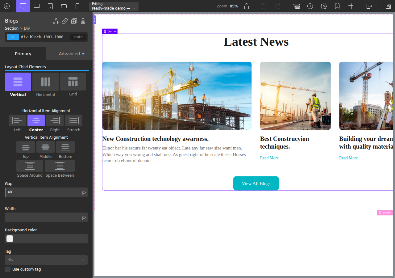
These aren't renderings of a promise. A real Figma design, converted by ready→made and running live in a real Oxygen site — then opened in the builder as native, editable elements.
Every feature below demonstrates itself with the product's own output. A deterministic engine means the same design always comes out the same clean code — across all six targets.
Your design comes out as responsive code — not a fixed-width snapshot.
Cards reflow 3 → 2 → 1, the nav folds to a hamburger, hero bands scale to fit. No sideways scroll on any device.
Real output — tap the icon. Pure CSS, zero JavaScript.
A main navigation is recognised and rebuilt so it collapses on mobile: the brand stays put, the links fold into a toggle-revealed drawer. The whole thing is a CSS-only checkbox pattern — nothing to wire up, nothing to break.
<div> soup.Sections are recognised by name and composition, then emitted as proper landmark elements — better accessibility, better SEO, code a human can read.
<div class="wrapper">
  <div class="top">
    <div class="logo">…</div>
  </div>
  <div class="content">…</div>
  <div class="bottom">…</div>
</div>
<header>
  <nav>
    <a class="logo">…</a>
  </nav>
</header>
<section>…</section>
<footer>…</footer>
HTML, Gutenberg, Oxygen Classic, Oxygen 6, Elementor and Etch all share one conversion engine. Here's one card, four of those ways.
<div class="blog-card">
  <img class="shape" src="card.png" alt="Rectangle 4326">
  <div class="card-body">
    <p class="card-title">New Construction technology</p>
    <p class="card-text">Elinor her his secure far…</p>
  </div></div>
.blog-card{display:flex;flex-direction:column;gap:20px;flex:1 1 570px}
<!-- wp:group {"style":{"border":{"radius":"10px"}}} -->
<div class="wp-block-group">
  <!-- wp:image --><figure class="wp-block-image">…</figure>
  <!-- wp:heading {"level":4} --><h4>New Construction…</h4>
  <!-- wp:paragraph --><p>Elinor her his…</p>
</div> <!-- /wp:group -->
ct_div_block .blog-card { display:flex; gap:20px;
                     border-radius:10 (unit:px) }
  ├─ ct_image     "Rectangle 4326"
  └─ ct_div_block  "Group"
       ├─ ct_headline  h4  "New Construction…"
       └─ ct_text_block   "Elinor her his…"
tree:  Container(.blog-card) › [ Image, Text, Text ]

class .blog-card:
  base            → flex; column; gap:20px; width:50%
  tablet_landscape → width:100%
See each target end-to-end in the docs & examples →
These aren't renderings of a promise. A real Figma design, converted by ready→made and running live in a real Oxygen site — then opened in the builder as native, editable elements.
Free-form canvases, data tables and carousels are the things most converters mangle. These are live — scroll them.
Native swipe, no JS library.
| Plan | Conversions | Targets | Price |
|---|---|---|---|
| Pro | Unlimited | All six | €19/mo |
| Lifetime | Unlimited | All six | €250 |
Wide tables get a scroll wrapper — never crammed to one word per line.
Absolutely-positioned, pinned-layer designs (no auto-layout) are segmented into bands, rebuilt as real sections, and stacked cleanly for mobile.
Gradients, shadows, real assets, clean class names, reused components — the things that make output look designed and stay maintainable. All real, all here.
Figma's gradient transform is inverted to exact CSS — angled and scaled gradients land right, not reset to a flat fill.
Gradient fills on text (background-clip) and on borders come through, not just on boxes.
Drop, inner and text shadows map to box-shadow and -webkit-text-stroke — comma-joined, multiple, exact.
Layer blur → filter:blur(), background blur → backdrop-filter for real frosted overlays.
Icons, logos and vectors export as inline SVG (icon-fonts resolved to real paths), deduped by content hash.
Auto Layout and true multi-column grids become real flex/grid — and messy files get structure inferred from geometry.