Figma radial and conic gradients to CSS: the gradientHandlePositions conversion formula

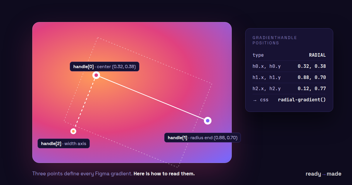
Figma's REST API describes every gradient with three normalized handle points — and for GRADIENT_RADIAL and GRADIENT_ANGULAR those handles define a center, a radius and a width instead of a line. Here is the exact conversion to CSS radial-gradient() and conic-gradient(), with working code. (For GRADIENT_LINEAR — including deriving handles from a raw gradientTransform matrix — see our linear gradient guide, or paste your fill into the free converter tool.)
Plugin API note: GradientPaint in the Plugin API typings has no gradientHandlePositions — that property exists only in REST API paint objects. In a plugin, derive the handles by inverting gradientTransform and mapping the gradient-space canonical points. These differ by gradient type: for radial and angular fills map (0.5, 0.5) (center), (1, 0.5) (radius) and (0.5, 1) (width); the points (0, 0.5), (1, 0.5), (0, 1) from the linear guide apply to linear gradients only — using them on a radial fill puts the center on the ellipse’s edge and doubles the radius. We verified both mappings side-by-side against Figma’s rendered output.
The handles are normalized to the node's bounding box — top-left (0,0) to bottom-right (1,1) — but they are not clamped: a dragged handle can sit outside the 0–1 range.
The formula: GRADIENT_RADIAL to CSS radial-gradient()
For a Figma GRADIENT_RADIAL fill, the first handle is the ellipse center, the second sets the radius along the primary axis, and the third sets the width along the secondary axis. Multiply each by the node's width and height to get the CSS radial-gradient() position and size.
// node is W × H px, handles h0 h1 h2 normalized to its box
center:   cx = h0.x * W          cy = h0.y * H
radius-x: rx = hypot((h1.x−h0.x)·W, (h1.y−h0.y)·H)
radius-y: ry = hypot((h2.x−h0.x)·W, (h2.y−h0.y)·H)
background: radial-gradient(
ellipse RXpx RYpx at CXpx CYpx,
#stop1 0%, #stop2 100%
);Color stop position values (0–1) map directly to CSS percentages — no renormalization needed, because we set the CSS ending shape to exactly the handle ellipse, so 0% → center and 100% → handle edge coincide in both systems. (If you used a keyword size like farthest-corner, you would need to renormalize.) If rx ≈ ry, emit circle RXpx instead of ellipse for cleaner output.
The catch: CSS cannot rotate a radial gradient's ellipse — radial-gradient() has no rotation component in the spec. If h1−h0 isn't axis-aligned (the designer rotated the gradient), the ellipse axes tilt and CSS has no syntax for it. Your options: bake the rotation into a wrapping element's transform, or accept the unrotated approximation. In our testing, Figma's own inspect panel drops the rotation too — if you've ever wondered why copied CSS "looks off" on a rotated radial, that's why.
The formula: GRADIENT_ANGULAR to CSS conic-gradient()
CSS conic-gradient() measures its from angle clockwise starting at 12 o'clock, while the direction of Figma's second handle is measured from 3 o'clock — so add 90° to the atan2 angle of the handle direction.
θ = atan2((h1.y−h0.y)·H, (h1.x−h0.x)·W)     // 0 = pointing right
from = ((90 + θ·180/π) % 360 + 360) % 360    // JS % returns negatives — normalize!
background: conic-gradient(
from FROMdeg at CXpx CYpx,
#stop1 0deg, #stop2 360deg
);Stop positions multiply by 360: a Figma stop at 0.25 is 90deg (CSS also accepts percentages here). The center is h0, converted to pixels as above.
Catch #1: both Figma and CSS sweep clockwise, but Figma renders the transition at the start angle softer than browsers do — if your first and last stop colors differ, CSS shows a crisper seam line than Figma. Duplicate the first color at 360deg to close the loop.
Catch #2: handles live in normalized space, so on a non-square node Figma's angular sweep is distorted relative to CSS's uniform pixel-space sweep. The formula above corrects the start angle, but mid-sweep stop placement can drift on strongly stretched nodes. If a designer put an angular gradient on a 3:1 hero, compare visually before shipping.
What about GRADIENT_DIAMOND?
Figma's fourth gradient type has no CSS equivalent — there is no diamond-gradient function. The nearest approximations: a radial-gradient() with the same center and stops (closest single-declaration result), or a four-conic-gradient() composite for pixel-faithful rendering, which is rarely worth it. Our converter emits the radial approximation and tells you it did.
Working code (radial + conic)
// REST API shape — the Plugin API GradientPaint has no
// gradientHandlePositions (see note above).
interface RestGradientPaint {
  type: string;
  gradientHandlePositions: { x: number; y: number }[];
  gradientStops: { position: number; color: { r: number; g: number; b: number; a: number } }[];
}

function radialToCss(fill: RestGradientPaint, w: number, h: number): string {
  const [h0, h1, h2] = fill.gradientHandlePositions;
  const cx = h0.x * w, cy = h0.y * h;
  const rx = Math.hypot((h1.x - h0.x) * w, (h1.y - h0.y) * h);
  const ry = Math.hypot((h2.x - h0.x) * w, (h2.y - h0.y) * h);
  const stops = fill.gradientStops
    .map(s => `${rgba(s.color)} ${round(s.position * 100)}%`)
    .join(', ');
  return `radial-gradient(ellipse ${round(rx)}px ${round(ry)}px at ${round(cx)}px ${round(cy)}px, ${stops})`;
}

function angularToCss(fill: RestGradientPaint, w: number, h: number): string {
  const [h0, h1] = fill.gradientHandlePositions;
  const theta = Math.atan2((h1.y - h0.y) * h, (h1.x - h0.x) * w);
  const from = ((90 + theta * 180 / Math.PI) % 360 + 360) % 360;
  const stops = fill.gradientStops
    .map(s => `${rgba(s.color)} ${round(s.position * 360)}deg`)
    .join(', ');
  return `conic-gradient(from ${round(from)}deg at ${round(h0.x * w)}px ${round(h0.y * h)}px, ${stops})`;
}
Want to sanity-check a specific fill? Paste its JSON into the free Figma gradient → CSS converter — it accepts both REST handles and Plugin-API gradientTransform matrices and runs this exact math.
This is the math our ready→made plugin runs on every fill — linear, radial, angular and diamond — when converting Figma designs to Gutenberg, Oxygen, Bricks or plain HTML. If you'd rather not hand-roll it: the free tier converts your own designs.