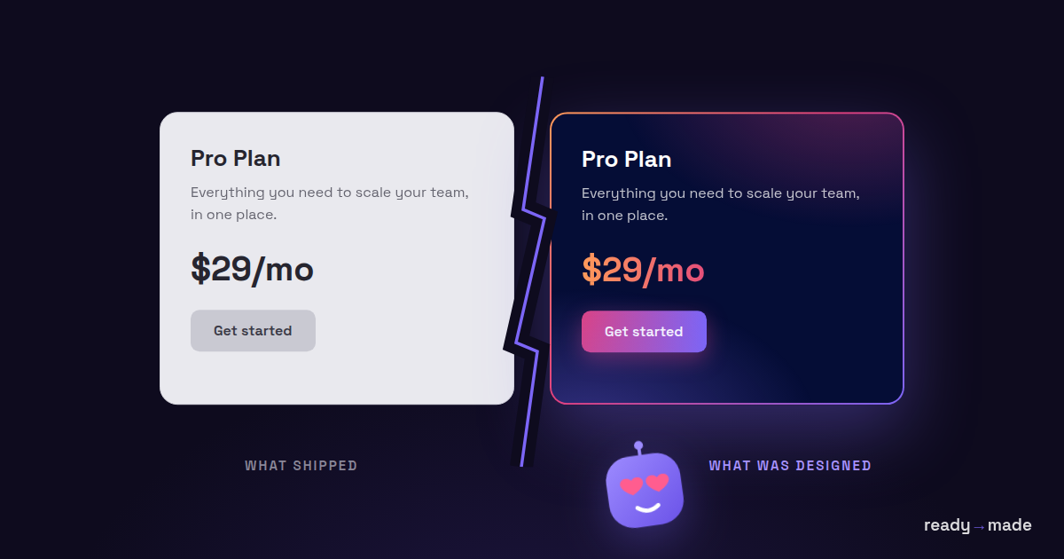
A polished product card isn’t just about pretty colors—it’s a performance promise. This one uses layered gradients and transparent borders to give depth without bloat:
The trick? Two gradients—one for the content, one for the border—stacked cleanly using the padding-box and border-box keywords. No extra wrappers, no pseudo-elements. Just elegant CSS that keeps load times light and visuals sharp.
That’s the same thinking behind great hosting: lightweight, layered, and fast.
From the makers of ready→made
Stop hand-coding what your design already says.
ready→made converts your Figma designs into clean HTML, WordPress, Oxygen & Gutenberg — a real layout engine, not AI guesswork. 90% there, not 90% slop.
 Philipp Gappmaier
October 30, 2025
Philipp Gappmaier
October 30, 2025
 Philipp Gappmaier
October 30, 2025
Philipp Gappmaier
October 30, 2025